ART MADRID: 20 YEARS OF CONTEMPORARY ART!
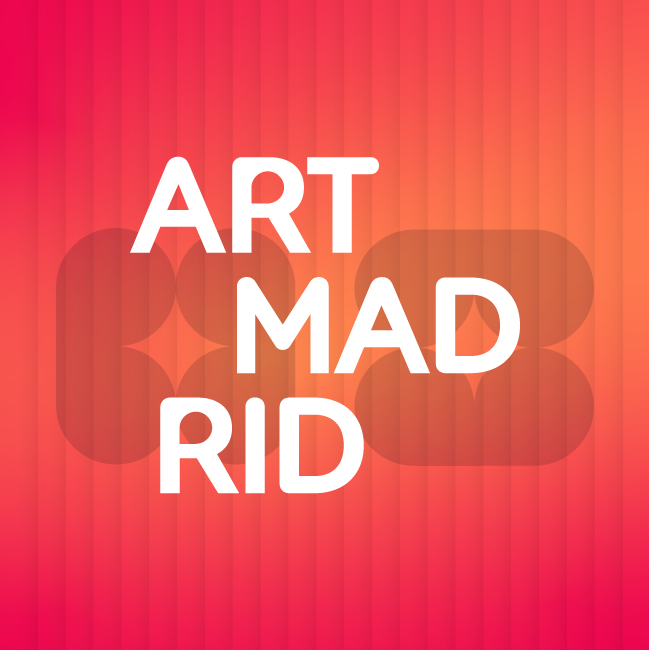
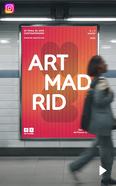
In a world where contemporary art is constantly evolving, our fair has decided to take a step into the future with a new image that reflects our evolution, energy, and commitment to art created both in Spain and beyond. Our new logo, colors, and typography are a reflection of an organic, dynamic approach in tune with current trends.
We have decided to give our identity a fresh twist, but let it be clear: this is not just an aesthetic rebranding; it is a transformation that reflects who we are today and where we want to go. We remain who we are: Art Madrid, a fair that is approachable, open, accessible, and transparent, but with a fresher, more dynamic feel, more in line with these times. We are committed to movement, diversity, and optimism. Because we believe art is not static; it moves, connects, and evolves, and we want that evolution to be evident in how we experience the creative processes within our event.
These two decades have been an incredible journey, full of challenges, learning, and above all, a lot of contemporary art. We allow ourselves a moment to look back and feel fortunate for the path we’ve traveled with artists, gallerists, collaborators, friends, and the public who have supported us up until now. Today, Art Madrid is renewed, looking to the future with eagerness for the journey ahead, fresh ideas, and a stronger-than-ever commitment to creativity, accessibility, and cultural dialogue. We want to continue being that meeting point where art and society connect in a special way, and where Madrid shines as one of the epicenters of contemporary art internationally.
NOW THE DESIGN
Change is not something that happens by chance; it is the result of careful listening, self-reflection, and understanding that each stage requires its own form of expression. Today, at Art Madrid, we present a new identity that not only reflects who we are but embraces all that we can become. Our essence has not changed, but the way we share it with the world has. This new design is more than a visual update; it is a commitment to the essentials, to the authenticity of our fair. We’ve chosen a clean and simple aesthetic, built from basic elements that reflect our search for clarity, balance, and depth. In simplicity lies strength, and this transformation proves it.
Art is dynamic, organic, always in motion. And our visual identity had to reflect that: original, solid, flexible, and capable of evolving. These principles have guided every decision in this process. Our logo, with its redesigned typography and carefully crafted strokes, conveys the confidence of knowing where we come from and where we’re going. It’s a brand that doesn’t need embellishments to stand out because every detail speaks with purpose.
THE COLORS OF EMOTION
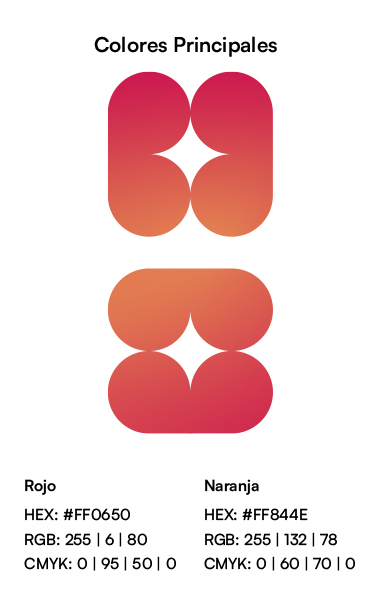
But it’s not all about form; it’s also about substance. The colors, vibrant yet balanced, are designed to connect on an emotional level. They represent our vision of art: accessible, human, transformative. With them, we want every encounter with our brand to be an experience that lasts, that inspires, that leaves a mark. This change also reflects our deeper values: transcending purely commercial purposes to become a bridge to something more meaningful. We invest in initiatives that foster education, sensitivity, and artistic creativity. We know that art has the power to enrich not only those who create it, but an entire community. And that’s what we want to keep doing: contributing to the cultural and social fabric around us.
ART MADRID: A LIVING AND FLEXIBLE BRAND
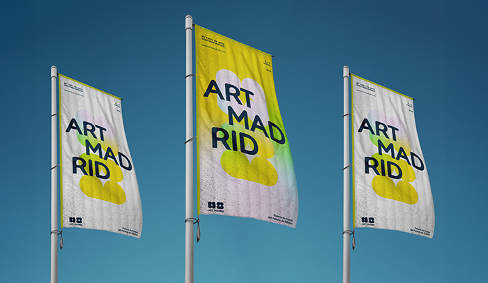
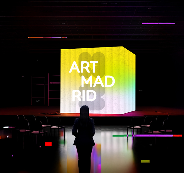
Our brand is not static; it is a living organism. It is flexible and organic, capable of adapting to the different scenarios we face, moving naturally between the emotional and the rational. This flexibility is essential for staying relevant in a constantly changing world. Every part of this transformation, from the standalone pictogram to the balanced modernism of the Satoshi Bold typography, is designed to generate recognition, loyalty, and engagement. We want to be more than just a brand; we want to be a symbol. A place where the abstract and the concrete meet, where the viewer can explore with their imagination.
WE ARE ART MADRID
Looking ahead, we reaffirm our commitment to the new generations. Emerging art is not only the future; it is the present that deserves to be seen, supported, and celebrated. At Art Madrid, we believe in being a space where these talents find a home and a community that encourages them to dream bigger. This is not just an aesthetic transformation; it is a statement of intent. It is our way of saying that art matters, that art connects, that art transforms. We want this new visual language to be the bridge that brings us closer to you, to the artists, to the galleries, and to everyone who makes art an essential part of their lives.
Welcome to this new phase of Art Madrid. It is clean, renewed, with the same passion as always, but with a much broader horizon. And we want to walk with you toward it.


 ·
· 