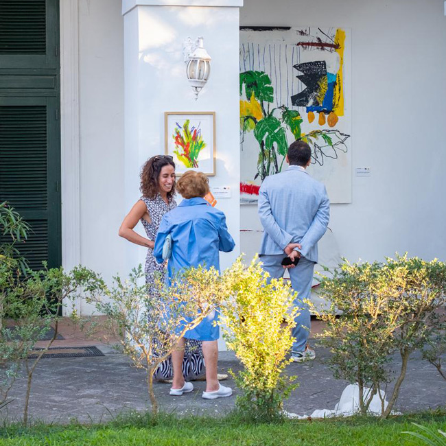
Art Madrid'24 – WHO SPEAKS AND WHERE? LATIN AMERICA AND THE CARIBBEAN AT ART MADRID

The artists and their works move narrative discourses presented before us with an expansive effect. Although inhabiting a geographical space, belonging to a specific social class, and having specialized training... are factors that define their work. Others, uncontrollable by the hand of flesh and blood, can change their perspective on life forever. This is precisely what happens with the creators who come to Art Madrid from further away, and we would say, those who have ventured across from the other side of the sea:
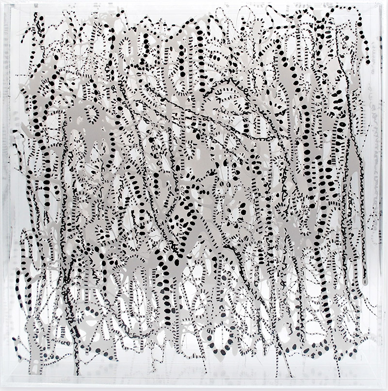
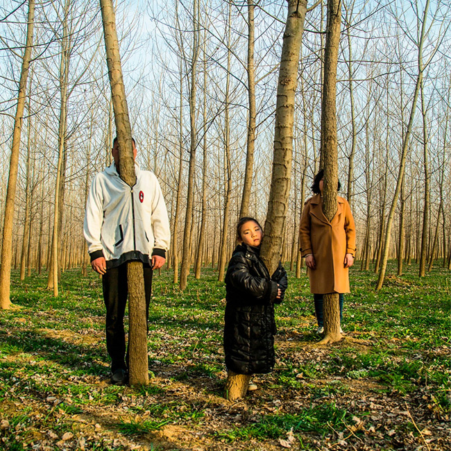
Ana Margarita Ramirez, Selva Blanca (2022) Galería Luisa Pita ©

Adrián Socorro, Matanzas, (Cuba), 1979. Collage Habana; Ana Margarita Ramírez, Caracas, (Venezuela), 1974. Galería Luisa Pita; David Planas, San Antonio De Los Baños, La Habana, (Cuba), 1976. Galería Luisa Pita; Evangelina Esparza, Rosario, (Argentina), 1980. DDR. Art Gallery; Fabio Camarotta, Buenos Aires, (Argentina), 1969. Art Lounge Gallery; Gustavo Díaz Sosa, Sagua La Grande, (Cuba), 1983. Galería BAT Alberto cornejo; Isabel Ruiz, Montevideo, (Uruguay), 1959. Nuno Sacramento Arte Contemporânea; Isabela Puga, Caracas, (Venezuela), 1997. Galería BAT Alberto cornejo; Marlene Stamm, Vacaria, São Paulo, (Brasil), 1961. Trema arte contemporânea; Mono Cieza, Argentina, 1969. Fousion Gallery. Roger Sanguino, Maracay, Venezuela, 1968. DDR. Art Gallery; Roldán Lauzán Eiras, La Habana, (Cuba), 1987. Collage Habana; Willy Ramos, Pueblo Bello, (Colombia), 1954. Galería Espiral; Yasiel Elizagaray, Sancti Spíritus, (Cuba), 1987. Collage Habana.
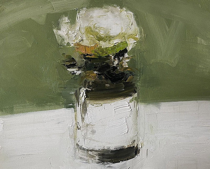
Adrián Socorro, “Flor” 2022. Collage Habana ©

A fair is, as you know, a window to the art market and a springboard for the thoughts and actions of those dedicated to creation. Art Madrid is. It is window and mirror. It is the regular appointment in which galleries and artists contribute and place their vision and interaction with the production of meanings in the hands of the public. Photography, drawing, painting, and sculpture are the most present manifestations in this edition. Discursively, they would come to answer that much-discussed question of what is art and what is not. But this time, the questioning is directed by the constant search for a polyphonic feeling, which brings together voices as different as they are authentic, around the figure of the artist who moves, who provides and directs the work in the movement. Whether in a temporary or permanent stay, the action of movement and migration as casuistry forever surround the exercise of creation.

As an art fair, we are interested in setting our sights on the production built from Latin America and the Caribbean, which has taken root in some way in our context. With increasing flow, artists such as those mentioned above move to other territories looking for other forms of life, and other experiences, thus articulating scenarios that give meaning to the messages that their works are capable of transmitting. Whether in an obvious way or permeated by some lyrical, poetic veil, raising the flags of denunciation or the activation of suspicion, they recount the impact that the change experience has left on their vision of the world. At this time, as the theoretician Néstor García Canclini would say, post and multi, more or less sophisticated repetition does not transcend. Attention is deserved by those positions that underline the differences and critically assess the uncertainty of postmodernity.
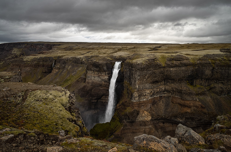
Isabel Ruiz, “Caída de agua” 2019. Nuno Sacramento arte contemporanea©

We ask ourselves, then, if the placidity of a landscape, the expansion of painting as a critical exercise, the rebuke of individuality, the struggle to build one's own space, and the polyphony of identity, which are, in this framework, an extension of Latin America and the Caribbean should speak from a single place. We think not. We dream of the possibility of being not only a mirror of current events but also a window of access to questioning. To be, above all, the right place for artists who allow themselves to take risks, venture out, and originate the birth of a fertile change in the land in which they reap their legacy.

ART MADRID: 20 YEARS OF CONTEMPORARY ART!


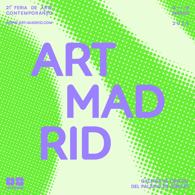
In a world where contemporary art is constantly evolving, our fair has decided to take a step into the future with a new image that reflects our evolution, energy, and commitment to art created both in Spain and beyond. Our new logo, colors, and typography are a reflection of an organic, dynamic approach in tune with current trends.

We have decided to give our identity a fresh twist, but let it be clear: this is not just an aesthetic rebranding; it is a transformation that reflects who we are today and where we want to go. We remain who we are: Art Madrid, a fair that is approachable, open, accessible, and transparent, but with a fresher, more dynamic feel, more in line with these times. We are committed to movement, diversity, and optimism. Because we believe art is not static; it moves, connects, and evolves, and we want that evolution to be evident in how we experience the creative processes within our event.

These two decades have been an incredible journey, full of challenges, learning, and above all, a lot of contemporary art. We allow ourselves a moment to look back and feel fortunate for the path we’ve traveled with artists, gallerists, collaborators, friends, and the public who have supported us up until now. Today, Art Madrid is renewed, looking to the future with eagerness for the journey ahead, fresh ideas, and a stronger-than-ever commitment to creativity, accessibility, and cultural dialogue. We want to continue being that meeting point where art and society connect in a special way, and where Madrid shines as one of the epicenters of contemporary art internationally.


NOW THE DESIGN

Change is not something that happens by chance; it is the result of careful listening, self-reflection, and understanding that each stage requires its own form of expression. Today, at Art Madrid, we present a new identity that not only reflects who we are but embraces all that we can become. Our essence has not changed, but the way we share it with the world has. This new design is more than a visual update; it is a commitment to the essentials, to the authenticity of our fair. We’ve chosen a clean and simple aesthetic, built from basic elements that reflect our search for clarity, balance, and depth. In simplicity lies strength, and this transformation proves it. Art is dynamic, organic, always in motion. And our visual identity had to reflect that: original, solid, flexible, and capable of evolving. These principles have guided every decision in this process. Our logo, with its redesigned typography and carefully crafted strokes, conveys the confidence of knowing where we come from and where we’re going. It’s a brand that doesn’t need embellishments to stand out because every detail speaks with purpose.

THE COLORS OF EMOTION

But it’s not all about form; it’s also about substance. The colors, vibrant yet balanced, are designed to connect on an emotional level. They represent our vision of art: accessible, human, transformative. With them, we want every encounter with our brand to be an experience that lasts, that inspires, that leaves a mark. This change also reflects our deeper values: transcending purely commercial purposes to become a bridge to something more meaningful. We invest in initiatives that foster education, sensitivity, and artistic creativity. We know that art has the power to enrich not only those who create it, but an entire community. And that’s what we want to keep doing: contributing to the cultural and social fabric around us.

ART MADRID: A LIVING AND FLEXIBLE BRAND

Our brand is not static; it is a living organism. It is flexible and organic, capable of adapting to the different scenarios we face, moving naturally between the emotional and the rational. This flexibility is essential for staying relevant in a constantly changing world. Every part of this transformation, from the standalone pictogram to the balanced modernism of the Satoshi Bold typography, is designed to generate recognition, loyalty, and engagement. We want to be more than just a brand; we want to be a symbol. A place where the abstract and the concrete meet, where the viewer can explore with their imagination.

WE ARE ART MADRID

Looking ahead, we reaffirm our commitment to the new generations. Emerging art is not only the future; it is the present that deserves to be seen, supported, and celebrated. At Art Madrid, we believe in being a space where these talents find a home and a community that encourages them to dream bigger. This is not just an aesthetic transformation; it is a statement of intent. It is our way of saying that art matters, that art connects, that art transforms. We want this new visual language to be the bridge that brings us closer to you, to the artists, to the galleries, and to everyone who makes art an essential part of their lives.

Welcome to this new phase of Art Madrid. It is clean, renewed, with the same passion as always, but with a much broader horizon. And we want to walk with you toward it.